
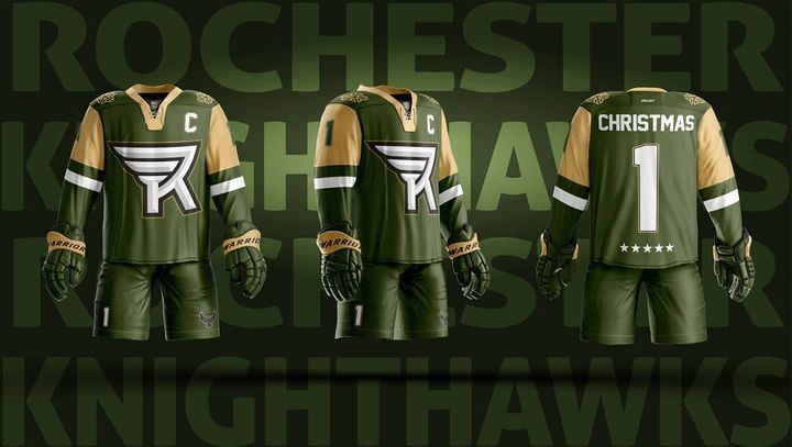
When @rocknighthawks announced their new logo and colors a few weeks ago, so many people cried foul at the loss of their beloved logo and "original" color scheme.
So I set out to show that this was an opportunity to make something new that might become just as iconic.
This was a lot harder than I originally imagined because I wasn't sure how exactly much of the old Knighthawks identity moved to Halifax.
So my home and away uniforms are clean and solid, very blue-collar looking, but could use a bit more personality, so I might take a look at them again once the Knighthawks release their actual uniforms and I can see what direction they are heading.
For the third, I wanted to play into the colors and the military history of Rochester. So I went with a stealthy all black with a ghosted wing pattern and some military inspired nameplates and badges to complete the look.
Oh, and since Rochester currently has no players on their roster, I thought it might be a great time to get Johnny Ch...
2
2