
Retooling a rebrand Vol. 2
Sacramento kings
Djossuppah Art
Uniforms:
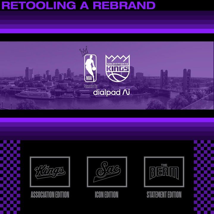
I wanted to keep the chain mail/sac flag inspo in the uniform as it was an underrated part of their uniforms during the previous run. New word marks for the icon (SAC) in cursive as well as “the beam” for the statement edition.
Courts:
Giving some love to past floor colors on the primary court, with the chain mail inside the arc on both sides, while using the checkered pattern on the main floor for the alternate design. Light the beam and #beamteam on the opposite side inbound areas.
Summary:
I wanted to give a new fresh new take on the kings while implementing old subtle elements that made their brand iconic. I’m most proud of the statement edition and think it better represents the team and it’s new identity. 🎽🩳🧦🏀🎨
Also a warning if you suffer from migraines, epilepsy, or are sensitive to bright colors and hues, I do apologize and issue a warning when viewing. ❤️
#sacramento #sacramentoproud #sacrame...
1
57
1
57